


Related Resources

The Hidden Cost of Missing Inventory: Why Manufacturers Lose Millions Before They Lose a Customer
Walk through almost any manufacturing plant, and you'll see machines running
9 Minutes Read
2026-07-03

AI Agent: Replacing Manual Workflows with Autonomous Systems
Most businesses don't have a people problem
10 Minutes Read
2025-12-31
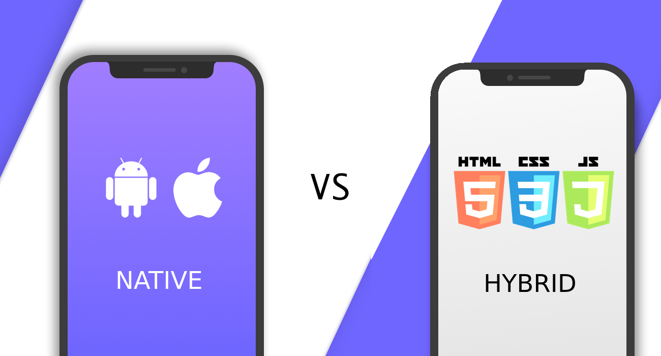
Native vs. Hybrid Apps: Why the Wrong Choice Could Kill Your Momentum
If you’re reading this, you’ve probably already made a key decision most never do
9 Minutes Read
2025-07-08

Funding Your App: How Smart Founders Build Without Burning Out
“The enemy of progress isn’t bad code—it’s a foggy plan funded by wishful thinking.”
8 Minutes Read
2025-06-26

Bringing Smart Devices to Life: How UTL Powers IoT Innovation from Firmware to Full Apps
There’s a big difference between building apps… and bringing products to life.
8 Minutes Read
2025-06-09

From Vision to Venture: How UTL Transforms Ideas into Scalable Digital Products
The Art of Turning Vision into Action. In the dynamic landscape of digital innovation
7 Minutes Read
2025-06-02

White Label Apps: Build It Once, Sell It Many Times
Imagine you’re holding a paintbrush in one hand and a blank canvas
7 Minutes Read
2025-05-27

Why Code Ownership Is the Most Overlooked Pillar of Digital Product Strategy
In today’s startup economy, the app is the asset. It’s the storefront, the supply chain
8 Minutes Read
2025-05-21

Designing Apps People Actually Enjoy Using
Why Great UX Is More Than Just Pretty Screens. Let’s face it
8 Minutes Read
2025-05-16

We Fix What Your Freelancer Tried Building
In today’s fast-paced digital economy, businesses of all sizes often turn
7 Minutes Read
2025-05-13

What to Expect in Your UTL Discovery Call
Thinking about building an app? Maybe it’s a raw idea in your Notes app
7 Minutes Read
2025-05-09

Powering Up Your Business in the Age of Rapid Innovation & AI
Today's business owners face a difficult balancing act: managing sales, operations
9 Minutes Read
2025-05-07

How Conqr-It Boosts Accountability and Motivation for Goal-Oriented Groups
Conqr-It is a mobile-first app designed to help small groups — from families
7 Minutes Read
2025-05-06

The One-Person Million-Dollar Company Is No Longer a Dream—It’s Happening Now
We are witnessing a powerful shift in entrepreneurship. The concept of building a million-dollar company
7 Minutes Read
2025-04-30

How to Integrate AI Into Your App Without Getting Overwhelmed
Let’s cut through the noise. Right now, everyone is talking about AI
7 Minutes Read
2025-04-29

How to Monetize Your App Like a Pro: And Stop Guessing
Builder. Strategist. Revenue realist. Let’s talk facts.
7 Minutes Read
2025-04-24

What Is an MVP?
Why Smart Founders Build Lean First—and Win Big Later
9 Minutes Read
2025-04-17

7 Ways to Reduce Development Costs Without Sacrificing Quality
When you start considering a product idea, it can be overwhelming
7 Minutes Read
2025-03-31

Agentic AI: The Future of Autonomous Business Automation
We are entering a new era of sequential context-based automation
8 Minutes Read
2025-03-28

How UtahTech Labs Helped Shub Gain Financial Freedom
RedSOS, founded by Shub, was built to provide personal safety solutions
7 Minutes Read
2025-03-25

How UtahTech Labs Helped Marco build a million Million-Dollar Business Rocktomic Revolutionize White-Label Supplement Branding
Marco, the co-founder of Rocktomic, envisioned a way to help entrepreneurs
7 Minutes Read
2025-03-24

Phased Development Approaches: Building Your Product in Cost-Effective Stages
In our previous discussion on strategic product development
7 Minutes Read
2025-03-24

Bootstrapping Your Tech Project: Development Strategies When Capital Is Limited
Developing a tech product with limited capital is challenging
9 Minutes Read
2025-03-24

Projection Analysis for Profitability: A 12-Month Forecast
This analysis forecasts the profitability of the app over a 12-month period
9 Minutes Read
2024-09-30

How to Choose the Ideal Subscription Price to Maximize Profit and Subscribers for Your App Launch
When preparing to launch an app, one of the most critical decisions
9 Minutes Read
2024-09-23

The Fastest Way to Generate Revenue through Mobile Apps in Today's Economy
Economic challenges influence consumer behavior. Mobile apps can be a unique
8 Minutes Read
2024-09-16

Things to Consider Before Starting an App Business: A Data-Driven Guide to Ensure Your App's Success
In today’s digital world, the app market continues to boom, and the potential
9 Minutes Read
2024-09-09

How to Understand GitFlow - Documentation, Training, Environments and Workflows
Table of content: GitFlow - Documentation & Training Resources
8 Minutes Read
2024-04-25

How to Organize Code Files in iOS
File structure is an ever changing spec based on many factors like
7 Minutes Read
2024-04-23
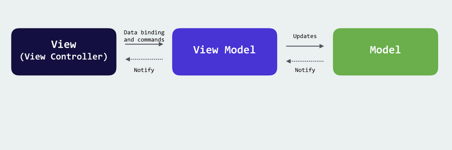
How to Implement the MVVM+ Design Pattern
Swift MVVM+Coordinators Overview When building UI features
7 Minutes Read
2024-04-19

How to Create App Certificates
A. Create Certificates 1. Login into https://developer.apple.com/account
7 Minutes Read
2024-04-17

How to Achieve the Basic Standard Coding Format for iOS Application
Project Structure: Root Directory: The root directory contains
5 Minutes Read
2024-04-15

How to use 6/5 Coordinator Pattern, PureLayout, & V2 Appointments Navigation & Architecture
Coordinator Pattern (presented by @Austin Betzer)
5 Minutes Read
2024-04-12

How to Style Swift Code
This style guide is based on Apple’s excellent Swift standard
20 Minutes Read
2024-04-11

How to Create a New Organization in GitHub
Step 1 : Log into your GitHub account on https://github.com/
5 Minutes Read
2024-03-22

How to create an AWS IAM Account
If you don’t have an AWS Account yet, please follow our
5 Minutes Read
2024-03-21

How to create a AWS Account
What is an AWS account? An AWS account is a container
7 Minutes Read
2024-03-20

How to create a Google Console Account
Prepare Business Information: Ensure you have all the
7 Minutes Read
2024-03-19

How to create an Apple Developer account
Here's a step-by-step guide to create an Apple Developer
7 Minutes Read
2024-03-18

How to set up your Jira account
Step 1 : Go to the link below: https://www.atlassian.com/software/jira
5 Minutes Read
2024-03-13
How to create a Google Cloud Platform account
Step 1 : Proceed with following link https://cloud.google.com/
5 Minutes Read
2024-03-12

Transforming Manufacturing with Computer Vision: An Overview
Computer vision, powered by artificial intelligence and machine learning
9 Minutes Read
2024-03-12

Harnessing the Power of Cross-Platform Software for Business Success
In today's fast-paced and technologically driven business
9 Minutes Read
2023-11-21

Why Every Company Needs a Mobile App in Today’s Digital Era
In today’s digital era, where convenience and quick access are the
8 Minutes Read
2023-11-20

Insights from the Future: Augmented Reality in Mobile App Development
Augmented reality (AR) is a rapidly growing technology with the
9 Minutes Read
2023-11-17

Winning Strategies to Enhance Customer Relationship Management Through Apps
In an era where customer interactions define the success
9 Minutes Read
2023-11-08

How to Test Your Mobile App Before Launch
In our digitally-driven world, mobile apps are more than just
9 Minutes Read
2023-11-07

Avoid These 11 Mobile App Development Mistakes for Success
In the bustling world of mobile applications, the line between
9 Minutes Read
2023-11-06

Web vs. Mobile Apps: Which is Right for Your Business?
As your business flourishes, you might be thinking about extending
9 Minutes Read
2023-11-03

Mastering the Market. The Ultimate Guide to Understanding Free vs. Paid App Downloads
In the dynamic and competitive landscape of mobile applications
9 Minutes Read
2023-11-02

The Art of Crafting a User-Favored Mobile App
Today, in a world dominated by more than 200 billion mobile apps
9 Minutes Read
2023-11-01

Navigating the Digital Labyrinth: The Art of Crafting Superior Web Applications
In an era where digital presence is not just an advantage but
9 Minutes Read
2023-10-31

The Ultimate Showdown: iOS vs. Android App Development
As we stand on the end of 2023, the landscape of mobile app
9 Minutes Read
2023-10-30

The Rise of React Native: Changing the Face of Mobile App Development
React Native is a ground-breaking technology that is
9 Minutes Read
2023-10-27

Optimizing Inventory for Efficiency and Growth
Insights into inventory management systems for optimal inventory
8 Minutes Read
2023-10-19

Game Production Pipeline: The Fundamentals of Today’s Video Game Design
Video games have evolved from simple 8-bit pixelated adventures
7 Minutes Read
2023-10-16

The AI Revolution: from Engineering to Online Education
In recent years, the field of artificial intelligence (AI) has
9 Minutes Read
2023-10-12

Mobile Apps and Databases Today: Implementing Data Privacy Rights
In an increasingly digital business world, mobile
9 Minutes Read
2023-10-11

Vendor Management and Relationships
Nearly half of all vendor collaborations—47% to be precise
9 Minutes Read
2023-10-10

Science Fiction or Reality? A Secure Smart Home with IoT in 2024
In this article, we'll explore the exciting world of IoT and how
8 Minutes Read
2023-10-04

Benefits of BLE-to-Cloud Integration
In today's interconnected world, Bluetooth technology has become
9 Minutes Read
2023-09-27

Enhancing FSM Efficiency and Performance with Enterprise Asset Management – 2024 and Beyond
Field service management (FSM) is a critical function for businesses that
9 Minutes Read
2023-09-25

How Artificial Intelligence is Transforming Creativity and Modern Expression. AI in Web Design 2023
In the ever-evolving landscape of technology, artificial intelligence
9 Minutes Read
2023-09-20

Virtual Worlds and Real-World Obstacles: The Challenges of Game Development in 2023
In the enchanting world of video games, where players embark
9 Minutes Read
2023-09-18

Struggling with Data Science in 2023? Challenges and Roadmap to Success
Reference site about Lorem Ipsum, giving information
8 Minutes Read
2023-09-12

IoT in Agriculture: Cultivating a Sustainable Future in 2023 and Beyond
With the global population steadily increasing and environmental
9 Minutes Read
2023-09-11

Mastering App Development: Winning Practices for Modern Businesses
The world of app development is in a constant state of evolution
8 Minutes Read
2023-09-08

Illuminating the Future: The Evolving Landscape of Supply Chain Visibility Solutions
In the era where global commerce thrives and consumer
8 Minutes Read
2023-09-06

Revolutionizing Efficiency. The New Power of Field Service Management Solutions
In today's fast-paced business landscape, optimizing operations
9 Minutes Read
2023-09-04

Data Science and Ethics: Navigating the Seas of Information Safely
In the dynamic landscape of 2023, data science has evolved
9 Minutes Read
2023-09-01

Unveiling the Magic of Game Development: Crafting Digital Realities in 2023
In the digital age, where imagination knows no boundaries
8 Minutes Read
2023-08-31

Navigating the Spectrum of AI: The 4 Types of Artificial Intelligence
In the ever-evolving landscape of technology, one term that
9 Minutes Read
2023-08-30

Exploring Exciting App Development Opportunities in 2023-2024
The landscape of app development is constantly evolving, driven
8 Minutes Read
2023-08-29

Synergizing IoT and AI: A Futuristic Convergence Redefining Possibilities
In the current era of technological advancement, two groundbreaking
9 Minutes Read
2023-08-28

IoT in Healthcare
In an increasingly digitized world, the Internet of Things (IoT)
9 Minutes Read
2023-08-07

Cloud Computing's Pivotal Role in Mobile App Development: Efficiency, Creativity, and Beyond
In today's fast-paced business landscape, cloud computing has
9 Minutes Read
2023-07-27

Leveraging IoT for Enhanced Sustainability: A Business Perspective
Many high-tech companies are placing an increasing emphasis on
9 Minutes Read
2023-07-20

The Intersection of AI and IoT: An Examination of Future Technologies
Modern technology is changing the world as it continually emerges
7 Minutes Read
2023-07-18

WoT (Web of Things) and IoT – What Sets Them Apart?
The Web of Things (WoT) takes the Internet of Things (IoT) to
9 Minutes Read
2023-07-17

Why Brand Style Guide is Important and How to Effectively Build It
We go through hundreds of messages, images, posts, and scroll
9 Minutes Read
2023-05-15

IoT Adoption Framework. How to Realize a Successful IoT Project?
The IoT is on the minds of many companies looking to add value
8 Minutes Read
2023-07-10

Digital Transformation with IoT in Manufacturing. The Future of Industry 4.0
The Internet of Things is one of the biggest names in the industrial
9 Minutes Read
2023-07-06

The Growth of Enterprise IoT Market: Facts, Statistics, and Future
The enterprise Internet of Things (IoT) market has witnessed
9 Minutes Read
2023-07-05

The 2023 IoT Security Landscape - Threats and Solutions
The Internet of Things (IoT) is a network of devices, vehicles, home
7 Minutes Read
2023-07-04

Uncover the Differences Between No-Code, Low-Code, and High-Code Development. A Comprehensive Guide 2023
It is no secret that apps have become an integral part
8 Minutes Read
2023-06-29

IoT in Tourism and Travel Industry: Examples, Trends, and Benefits 2023
Tourism is one of the most important components of economic
9 Minutes Read
2023-06-27

Mobile App Rejection: Reasons and How to Avoid
After all the hard work that you put into designing and developing
7 Minutes Read
2023-06-26

7 Common Mistakes Enterprises Make When Outsourcing Mobile App Development
The mobile app development industry has come a long way
8 Minutes Read
2023-06-26

Mobile App Development Strategy. How to Solve Problems with Innovative Apps?
As we increasingly rely on our smartphones and tablets in our
8 Minutes Read
2023-06-13

5 Common Web Development Myths You Should Stop Believing Today
Making an online presence for your business can be challenging
7 Minutes Read
2023-06-09

Mobile Application Security Today. Definition, Practices, and Benefits
With more mobile applications being developed and deployed
9 Minutes Read
2023-06-07

Navigating the Maze of IoT Security: Protecting a Connected World
The vast expansion of the internet of things (IoT) has forced
8 Minutes Read
2023-06-05

Mobile App Localization in 2023. Definition, Advantages, and Technical Aspects
Mobile app localization is the process of adapting an app
7 Minutes Read
2023-06-02

How to Add Value to Your Fintech App? Today’s Market Needs
The times of great change continue to drive and accelerate
7 Minutes Read
2023-05-31

Is Web App Development Still Relevant in 2023? What You Need to Know
To find out more about web applications - from their
9 Minutes Read
2023-05-30

Launch Smarter: Creating an MVP that Raises Money for Your Mobile App
Launch smarter, not harder. Why create a Minimum
8 Minutes Read
2023-05-29

What is Modern Web App Development? 6 Key Principles
It’s simple: today users expect more than ever. They want
7 Minutes Read
2023-05-23

What Should We Know About Embedded Systems Trends for 2023
While the majority of people can easily describe well-known
9 Minutes Read
2023-04-28

From Product to Connected Product-as-a-Service. Transforming the Business Model Through IoT in 2023
One of the biggest opportunities within the IoT is the
9 Minutes Read
2023-04-11

IoT for Industrial Manufacturing and Smart Cities. 12 Great Use Examples for Businesses
One of the biggest industries in the world, manufacturing, cannot
9 Minutes Read
2023-04-05

Why You Should Prototype Your IoT Device. The 5 Biggest Reasons
The process of going from a theoretical phase in which
7 Minutes Read
2023-04-04

IoT Devices Security Threats in 2023. How to Protect Your IoT Ecosystem?
Nowadays, IoT devices are everywhere: homes, hospital rooms
9 Minutes Read
2023-03-31

A Successful Hardware Design for Your IoT Project in 2023. Full Guide
Designing and building the Internet of Things hardware is
9 Minutes Read
2023-03-29

3 Key Stages to Successful App Design. Best Practices and Tips
There’s no substitute for great design. Look at your favorite visually
8 Minutes Read
2023-03-28

The Importance of Regular App Maintenance: How to Protect Your Business
The sad truth is that the cost of application maintenance
7 Minutes Read
2023-03-13

App Development for E-commerce. You Need to Know This
Global retail sales growth will continue to rise and take up
9 Minutes Read
2023-03-08

Real Examples of How Businesses Thrive with Custom API Integrations
APIs have literally transformed the way businesses operate
7 Minutes Read
2023-02-08

Why and When You Should Update Your UI. A Winning User Interface Design
If you doubt that even a great UI design will be good enough
9 Minutes Read
2023-02-06

Hiring Mobile App Developers in 2023. Key Secrets
Nowadays, people are more likely to choose a
7 Minutes Read
2023-01-27

Web Conferencing vs. Virtual Classroom. What is Best for Your Organization?
The future will be about pairing the Artificial Intelligence of
7 Minutes Read
2023-01-25

Better Virtual Learning in 2023. Simple Rules
Whether you’re in high school or going through professional
6 Minutes Read
2023-01-20

Best Tips to Improve Your Field Service Management Operations
While the complex, nuanced factors contributing to success in the
8 Minutes Read
2023-01-19

The Metaverse for Work Made Real. Digital Office in 2023
New technologies and the digital world of the Metaverse
9 Minutes Read
2023-01-17

The Ways in Which the Metaverse Contributes to the Quality of Education
Does the concept of the Metaverse excite or scare you
5 Minutes Read
2023-01-16

4 Environmental Benefits of Working in a Virtual Office Environment
To understand the sustainability implications of working virtually
5 Minutes Read
2023-01-12

5 Tips to Make Virtual Working Environment Work for You
When managers and company leaders prioritize employee engagement
6 Minutes Read
2023-01-10

Developing a User-friendly App in 2023. What is Important?
A good-looking and fast mobile app can not be worth its money
9 Minutes Read
2023-01-09

When and How to Redesign Your Mobile Application. + Key Steps
App redesigns have received a bad rap over the last few years
6 Minutes Read
2023-01-02

How to Reduce Mobile App Development Costs? Key Tips to Keep in Mind
Do you want to order food online? There is an app for that. Or maybe
8 Minutes Read
2022-12-30

Artificial Intelligence in App Making. What Does it Look Like in 2023?
AI (Artificial intelligence) has proven to offer great tools that help startups
9 Minutes Read
2022-12-29

DAPPS in 2023? Understanding Decentralized Applications
Decentralized applications are emerging with over 70 million active
6 Minutes Read
2022-12-22

Top 6 Android App Development Fundamentals for Those who Start
Users are increasingly drawn to mobile apps because of the amazing
8 Minutes Read
2022-12-14

Vue.js vs React – Which JavaScript Framework Will Work Best For You?
Businesses nowadays aspire to develop high-quality web
9 Minutes Read
2022-12-08

The Rise of Web 3.0 What Does it Mean for the Gaming Industry?
More and more people are now getting increasingly attracted by new gaming
6 Minutes Read
2022-12-07

Top Reasons to Choose Unity 3D for Your Next Game Development Project
Selecting a suitable game engine is essential for a successful
5 Minutes Read
2022-12-02

Enhancing the Performance of Field Service Providers with One Smart Software Solution
Why Field Service Software is Important. Field service management software
8 Minutes Read
2022-11-23

A Fully Customized Solution to Track Your Sales and Technician Teams in 2023
This article will discuss how your pest control company can take advantage
6 Minutes Read
2022-11-21

How Business Process Management (BPM) Helps Hyperautomation Success
Effective business process management lies at the heart of not only
8 Minutes Read
2022-11-14

Emerging Mobile App Technologies for 2023 and Years Beyond
Having a mobile app in this digital era has become a basic need
6 Minutes Read
2022-11-04

Marketing in the Metaverse. Here is what you need to know
The key to marketing is to stay in front of the target audience
7 Minutes Read
2022-10-31

11 App Design and Development Trends for 2023. Statistics-based Predictions
The ever-evolving web and mobile app development industry is constantly
8 Minutes Read
2022-10-26

MVP - Why is it Beneficial for Businesses?
Every enterprise and company start their journey with a product
6 Minutes Read
2022-10-25

Fundamental Practices to Maintain Software Security. Before, During & Post Launch
Nowadays, protecting information is paramount, as it’s at the epicenter
6 Minutes Read
2022-10-10

The Secrets to an Outstanding UI Design. Best Practices and Examples
User interface (UI) design is likely the first thing you notice when you start
5 Minutes Read
2022-09-26

A Guaranteed Formula for a Successful Software Product Development
I have been working on software development projects for more than
8 Minutes Read
2022-09-21

Thinking of Monetizing Your PC or Mobile Game? Learn How
Game development takes time, effort, and resources. And on the initial
5 Minutes Read
2022-09-19

Wondering Why Software Projects Fail? Here are Few Major Reasons
While you are probably still angry with your last software development
6 Minutes Read
2022-09-13

Work Virtually? How the Metaverse is Shaping the Future of Work
In this article, we'll cover: What are the Metaverse opportunities for work?
8 Minutes Read
2022-08-31

How to Create a Metaverse World for Your Business?
In the fast growing digital era, creating a Metaverse world is one of the most
8 Minutes Read
2022-06-16

The Power of Data for Sales Businesses
Analytics plays an increasingly important role in B2B sales while
5 Minutes Read
2022-04-25

Top Skills for a Data Science Team
“We’re entering a new world in which data may be more important than
5 Minutes Read
2021-11-03

Artificial Intelligence for Cyber Security
The unexpected growth of online systems and higher online traffic
8 Minutes Read
2021-10-28

Keep in Mind While Building Large-scale Web Application
When it comes to large-scale web applications, performance is the
8 Minutes Read
2021-10-21

How to Benefit from Data Science in HR Sector
Data science and machine learning are becoming new trends and very
6 Minutes Read
2021-10-08

Understanding Game Development Process: 6 Crucial Stages
Millions of people mass online to buy and play new awesome video games
6 Minutes Read
2021-11-01

What is Data Science and How the Companies Can Benefit from it in 2021
“Given the massive amounts of data that are produced nowadays, Data Science
8 Minutes Read
2021-05-17

How to Create the Best Enterprise Application Strategy in 2021
Editor's note: In this article, we will share some useful tips on the use of the core
5 Minutes Read
2021-04-05

6 Myths About the Game Development Industry
Thanks to the combination of increasing popularity, especially in the mobile
5 Minutes Read
2021-03-31

What is the Internet of Things and is it Safe? Simply Explained
Our planet has more connected devices than people. And Business Insider
5 Minutes Read
2021-03-16

Best Connectivity Solutions Within the IoT Technology
Reference site about Lorem Ipsum, giving information
5 Minutes Read
2021-02-23

How to Improve Your Business Performance With Data-driven Content Marketing Strategy
In recent years, businesses have realized how important data is to successful
10 Minutes Read
2020-12-29

9 Hidden Challenges of Enterprise Mobility Application Development
The technological age is well and truly upon us. Numerous technology
5 Minutes Read
2020-12-16

What You Would Need to Know Before Hiring Unity Game Developer
The number of game lovers all over the globe counts millions of people. The
5 Minutes Read
2020-12-04

Black Friday 2020 to Boost Up Your Software Products Sales
Why is Black Friday important? The famous Black Friday, the day after
5 Minutes Read
2020-11-25

The Art and Science of Game Design and Development
Thanks to the growing number of software developers and the hardware
5 Minutes Read
2020-11-18

Grow and Manage Your Business With Pest Control Software Knowing the Industry Prediction
If I were ever abducted by aliens, the first thing I’d ask is whether they came
6 Minutes Read
2020-10-14

Key Features to Look at When You Purchase Your Field Service Software
The task of managing the team of technicians who rarely report to the
5 Minutes Read
2020-08-31

Strategies to Grow Your Pest Control Business
Landlords, homeowners, and property managers need to count on the most
5 Minutes Read
2020-08-31

How Pest Control Companies can Automate Sales and Services to Grow Faster
Every Pest Control Company has their different kinds of advantages, and they
5 Minutes Read
2020-08-01

Why Education Should be Supported With Online Tools
Technology will always affect various aspects of our lives, the education
5 Minutes Read
2020-02-25

How E-commerce Will Save Businesses During the 2020 Financial Crisis
E-commerce is taking over the business world as online servicesare becoming
10 Minutes Read
2020-07-21

Why Time to Market is the Most Critical Now?
Time to Market is the time taken by a product from envisage to release
5 Minutes Read
2020-07-16